Dmart Ready App
India's Largest Ecommerce App Offering Discounts on Grocery Products


Project Category
Personal Project
Role
UIUX- Mobile App Design
Tasks
User Research & Interection Design, UI Design, Design Strategy
Year
2025
Timeline
4 Weeks


Launched in 2017, the app helps DMart reach people who prefer shopping from home using their smartphones.
What is Dmart ready?
The DMart Ready App is an online grocery platform from India's popular budget supermarket chain, DMart, allowing users to shop for groceries, staples, and household essentials with features like daily discounts, home delivery, or free pickup from designated points, aiming to offer the same low prices as their physical stores through a convenient digital experience.
How It Works (The Business Model):
DMart Ready uses a "hybrid" model, meaning it combines online shopping with their physical locations. There are two ways customers get their orders:
Home Delivery: The order is brought directly to the customer’s house for a small delivery fee.
Pick-up Points: Customers can choose a nearby "DMart Ready Pick-up Point." These are small kiosks or sections of a store where you can collect your order for free

Overview
of Dmart Ready App
My Role
Design Strategy
User Persona
User Flow
Prototyping
Visual Design
Wireframing
Usability Testing
Empathy Mapping
User Research
Information Architecture
Competetive Analysis
Solution
Problem
Problem Overview
DMart Ready app users face difficulty while shopping for groceries online because the app interface is outdated and confusing..
Due to this, the cart abandonment rate is high and user satisfaction is low.
We need to design an intuitive, modern, and user-friendly shopping experience that maintains DMart’s “value for money” brand image and also improves online sales and customer retention.
Current App Problems (Initial Observation):-
Users face these problems in the current DMart Ready app:
Outdated UI/UX design
Poor product discovery
Complicated checkout process
Lack of personalization
No Reorder option available
No clear visual hierarchy
These issues make the app difficult to use and increase user frustration.
What is Our Business Goals
Primary Goals
Decrease cart abandonment rate
Increase checkout completion rate
Increase Daily Active Users (DAU)
Increase Average Order Value (AOV)
What is Our Business Goals
Secondary Goals
Increase app rating from 3.8 to 4.5+
Improve user retention rate
Reduce customer support calls
Increase brand trust and loyalty
Who is Our Target Users
Primary Users
Homemakers (25–45 years)
Nuclear families
Working professionals
Users from Tier 1 and Tier 2 cities
What is Our Business Goals
Secondary Users
Young couples
Improve user retention rate
Students
Senior citizens
Goal
Design Process
1
User Research
User Interview
Competative Analysis
Empathize


2
Persona
Empathy Map
User Journey
Affinity Mapping
Define
3
Ideate
Information Architecture
Ideate

5
Usability Testing
Implementing Feedback
Test


4
Wireframing
Visual Design
Prototyping
Design
R
S
rohitsharma31295@gmail.com
What problems do users face when using this app?
During my user research on the DMart Ready app, I received many complaints from users about the overall experience of the app. The biggest issue users mentioned was that the home page is completely cluttered and confusing, with many visual glitches and an outdated design. When users compare DMart with competitors like Blinkit and Zepto, they feel that competitor apps are smoother, more modern, and better organized, while DMart feels old and poorly designed. Users also complained about the top bar, where the search bar is too small and does not encourage them to search for products. They feel uncomfortable typing in it.
The hamburger menu also feels unnecessary because most of its options are already available in the bottom navigation under My Account, which creates repetition and confusion. Another major issue is related to delivery slots. On the home page, the app shows very limited slot timings, such as 2 PM to 5 PM, which makes users think that only one slot is available. But during checkout, many slots appear, and many of them do not work, which reduces user trust.
Users also feel that the product showcase on the home page is very unorganized, like books scattered on a messy desk, while competitor apps arrange products neatly like books on a shelf. On product cards, DMart only shows price, product name, and quantity, but competitors also show ratings, reviews, stock availability, and delivery time, which builds more trust and helps users decide faster. Because this information is missing, users feel less confident while shopping on DMart. Users also complain that the home page uses too many random colors without consistency, which makes the app feel unstable and visually tiring.
In the bottom navigation bar, both the Home button and the 50% Discount button look active at the same time, which confuses users about which page they are currently on. There is also no Reorder option, which is inconvenient for repeat customers.
The checkout process is another major pain point because it is too long and complicated, with too many confirmation clicks. Users must confirm the same step multiple times to move forward, which feels frustrating and slow. The checkout page also lacks clarity, as users cannot clearly see total items in cart, selected slot details, or bill breakdown properly. Unlike competitor apps, DMart does not suggest related products during checkout, so users cannot easily add more items. If users remember something at the last moment, they must go back to the home page again, which breaks the flow. Users also reported that return policy and bill details are not clearly explained, which reduces transparency and trust. Finally, users feel restricted because they cannot easily change their delivery location during checkout, which creates problems when plans change suddenly. All these issues together make the DMart Ready app feel confusing, outdated, and less trustworthy compared to modern quick commerce apps.
Problem
Statement

Resetarch Insight
Home page feels messy and old
Users feel the DMart home page is too crowded, has visual glitches, and looks outdated. They find competitor apps cleaner and more modern, so they prefer using them.
Search bar is small and not attractive
Users say the search bar is too small and uncomfortable to type in. It does not motivate them to search products easily. there is not voice search. njklk nfmmm
Delivery slots & bottom bar create confusion
Users see limited slots. Many slots do not work, which reduces trust in the app. We don’t have Reorder features to reorder the products.nnjjjnnnnnnnnnnnnnnnn
Checkout process is slow and frustrating
Users must confirm the same step multiple times. Too many clicks make checkout long and annoying. nnnjnjjjjjjjjjjjjjjjjjjjjjjjjjjjjjjjjjjjj
Checkout page does not support quick decisions
Users cannot easily add more items, see clear order details, or change location easily during checkout. This breaks the shopping flow.
Product cards lack useful information
DMart only shows price, name, and quantity. Users want ratings, reviews, stock info, and delivery time to feel confident before buying.
Competitive Analysis
Feature Name
Dmart App
Blinkit App
Zepto App
Jio App
Bigbasket
Home UI
Messy/ Old
Clean
Clean
Organized
Clean
To find product categories
Hard
Excellent
Excellent
Good
Excellent
Checkout process
Too long
Quick
Quick
Medium
Medium
Product Information
Few
Detailed
Detailed
Detailed
Detailed
Reorder
Features
No
Yes
Yes
No
Yes
Delivery Slot Available
Limited
More
More
More
More
No
Yes
Yes
Yes
Yes
Does the app suggest products on chechk- out pg Like:
You may also like
Based on your search
Frequently Bought Together

Empathy
Map

Thinks
I don’t trust these products.
I might make a wrong purchase.
Shopping should be fast and simple.
This app feels old compared to others.
I should use Blinkit or Zepto instead.
Says
This app looks messy.
Why is everything so confusing?
I can’t see ratings or reviews.
Checkout is taking too much time.
Other apps are easier to use.
Thinks
I don’t trust these products.
I might make a wrong purchase.
Shopping should be fast and simple.
This app feels old compared to others.
I should use Blinkit or Zepto instead.
Does
Tries to search but feels uncom- fortable typing
Scrolls a lot to find products
Leaves the app without completing the order
Switches to competitor apps for shopping
Feels
Confused because of cluttered UI
Frustrated during checkout
Tired because of too many steps
Insecure due to no reviews or ratings
Disappointed with the overall experience
Affinity Mapping

Home pg & Visual Design Issues
Home page looks cluttered and confusing
Design feels outdated and old
Too many colors style are used
Too many visual glitches on the screen
App feels unstable compared to modern apps
Product Discovery & Listing Issues
Product showcase is unorganized
Products look scattered like a messy desk
No clear structure on home page
Competitor apps look neat and well arranged
Product Card Information Gaps
No product ratings visible
Only price, name, and quantity are shown
No delivery time shown
Low trust because of missing information
Navigation Problems
Home and 50% Discount both look active, Users cannot tell which page they are on
No Reorder option for repeat users
Repeat users waste time searching again
Checkout Flow Issues
Checkout process is very long
Too many confirmation clicks
Checkout feels slow and Boring
Checkout Page Clarity Issues
Total items in cart not clearly visible
Selected delivery slot is unclear
Bill breakdown is confusing
Return policy is not clearly explained, And also Low transparency and low trust
Missed Business Opportunities
No product suggestions at checkout
No “You may also like” section
Users cannot add items easily at last moment
Users must go back to home page. Breaks shopping flow
Delivery & Location Issues
Limited delivery slots shown
Many slots do not work
Users feel confused and lose trust
Cannot easily change location at checkout
Problems when plans change suddenly
Visual
Design with Details
Before
After

9:41
Delivery to Selected Location
Laxmi Nagar Chinchpada-425417....,
Search for Tea
All
50% Off
Cristmas
Winter
Electronics
Beutya
Fresh
All
All
Special Offers At Everyday
Today Offers
Get Special Offer
20%
Up to
Order Now

Shop By Categories




Dairy, Milk
Tea


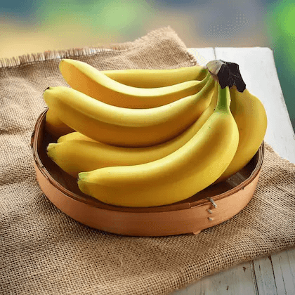

vegetables & Fruits


Atta, Dal
Rice
Home
Category
Discount
Reorder
Account
01 - Home Page Details
Redesign the home page to attract users and encourage them to buy products easily without any hassle or confusion.
01 - Checkout Page Details
I redesigned the checkout page to reduce the number of tapping steps for users. The main goal was to make the checkout process easy, fast, and flexible. I wanted users to feel free to add products even at the last moment and still complete their order without any stress.
Remove the menu since all options are already available in the account, so consolidate and fix all options in one account.
We give users a mic voice feature so they can search products without typing. This is helpful for users who cannot type fast. We also give a camera search option for users who do not know the product name in English or Hindi. They know the product in their mother language, so they can just click a photo of the product and upload it to search. We also make the search bar bold, big, and very clear so users feel attracted to use it easily and can find what they need fast.
We add a Special Offers – Everyday Card so users can easily see and buy daily offer products. Users do not need to scroll down a lot to find discounts or offers of the day. They can directly buy the product by clicking the Order Now button.
DMart shows very limited product information, so I refined the product cards by adding more useful details. I added product ratings, delivery Time & date, how many items are left in stock, and how much money users are saving per kg. This extra information increases user trust and confidence. Because of this, users are more likely to buy more than one product, which helps improve DMart’s business growth.
Easy to add Save for later, previous there is gap for add to wish list.
I also added a Special Offer Card that shows three different discount types in one place, such as 50% discount, 30% discount, and 70% discount. This allows users to choose offers based on their preference. Showing multiple discount options in one card is a good UX strategy because it makes offers easy to understand and compare.
Normally, in a bottom navigation bar, only one tab should be highlighted at a time. But in the DMart app, both the Home tab and the 50% Discount tab are highlighted together, which confuses users. So, I refined the bottom navigation and made only one tab active at one time. You can see how I refined it in the app image. Also, there was no Reorder option earlier. So, I added a Reorder tab, which helps users quickly reorder products from their past order history. This saves time and makes repeat buying very easy.
Note: Normally, in a bottom navigation bar, only one tab should be highlighted at a time. But in the DMart app, both the Home tab and the 50% Discount tab are highlighted together, which confuses users. So, I refined the bottom navigation and made only one tab active at one time. You can see how I refined it in the app image. Also, there was no Reorder option earlier. So, I added a Reorder tab, which helps users quickly reorder products from their past order history. This saves time and makes repeat buying very easy.
Reorder your past product
We replace the cart icon with a wishlist icon because many users want to save products and buy them later when they get better discounts. We show the Add to Cart items below a floating button, so users can access both features easily without any confusion.
We add a category-wise product navigation
bar so users can buy products without searching. This helps users quickly understand what types of products are available. Categories include All, 50% Discount, Seasonal, Festival, and Electronics. For example, if a user clicks on the Electronics tab, then all electronic products will appear on the screen and the user can buy them easily.
Fresh Fruits & Vegetables
See all 150+

Add
30
Off
4
Pc
30
Save
Special Royal
Apple Gala
(Seb)...
4.5k
4Hr
Only 30 Pc Left
170
MRP
200

Add
50
Off
1
Kg
50
Save
Fresh & Rasila Lemon (Nimubu)...
3.5k
4Hr
Only 10 kg Left
50
MRP
50

Add
50
Off
1
Kg
50
Save
Special & Sweet
Nagpur Orange
(Santra)...
3.5k
4Hr
Only 10 kg Left
50
MRP
50
Special Offers For You
50% Off On Groceries

30% Off On Fashion

70% Off On Kids Toys

Home
Category
Discount
Reorder
Account
Buy
Order


Before Checkout step:
This process start after user add products & hit the Cart Button
After Checkout step:
This process start after user add products & hit the Cart Button
Confirm Address
Select Slot
Confirm slot
Continue
Select Payment
Cash On
place order
proceed to checkout
Confirm Address
Select time slot
5 to 6 pm
Confirm slot time
Proceed to pay
cash on
Place Order
Confirm order


Business
Growth Conclusion
This redesign helps DMart Ready improve both user experience and business growth. By making the app clean, simple, and easy to use, users can find products faster and complete checkout with less effort. Clear product information, better visual hierarchy, and a smoother checkout flow help reduce cart abandonment and increase trust. Features like reorder, product suggestions, and flexible checkout options encourage users to buy more items and return to the app again. Overall, this redesign supports DMart’s value-for-money image while increasing conversions, average order value, and customer retention.
What I Learned
from This Case Study
From this case study, I learned how poor UI and UX directly affect business performance. I understood the importance of visual hierarchy, clear information, and reducing user effort at every step. I also learned how small improvements like reorder options, better checkout flow, and product suggestions can increase user trust and sales. Most importantly, I learned to design from a user’s point of view, not just for looks, but to solve real problems and support business goals.
Let’s
Work Together
Get in touch and let's create something amazing! I'm here to help with all your design needs and look forward to working with you.
rohitsharma31295@gmail.com
+91- 9730073353
Thanks For Watching!
© Rohit Sharma 2024. All rights reserved
Behance